If your website gets visits but few leads, you likely have a clarity gap, not a traffic problem. This guide breaks down cta meaning, the traditional and modern call to action meaning, how CTAs apply to small-business websites, and a practical mini-guide for button styling, placement, design, and SEO. Every section ends with a simple next step—and, yes, we’ll model strong call to action buttons along the way.
Need a quick win? Get a free CTA audit and we’ll show you what to fix first on your most important page. We know… a CTA inside a CTA. It’s CTA-ception.
The Traditional Meaning of a Call to Action
Before the web, the call to action meaning was literal: “Call now,” “Visit today,” “Mail this form.” It’s a clear prompt paired with an outcome. That tradition still matters online. At its core, what does CTA mean? The meaning of cta is a direct request plus a result the visitor understands. For a compact historical overview, skim this background on Wikipedia and note how CTAs evolved from print to digital.
Your step: Write the outcome first (what the visitor gets), then choose the verb. That’s how cta means “progress,” not pressure.
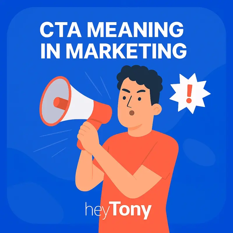
CTA Meaning in Marketing Today
Call to action meaning in marketing is the bridge from attention to revenue. Each page deserves one primary next step that fits its role in the funnel:
- Top of Funnel (TOFU): “Get the guide,” “See how it works.”
- Middle of Funnel (MOFU): “View pricing,” “Watch the demo.”
- Bottom of Funnel (BOFU): “Book a call,” “Get a quote.”
If aligning actions to stages feels fuzzy, skim our plain-language guide to marketing funnel stages and pick a single outcome per page. That’s cta meaning marketing done right.
Your step: On your homepage, make one button visually primary and demote everything else. Clarity converts.
What CTA Means for a Small-Business Website
For most small businesses, the job of a CTA is simple: move a visitor one step closer to working with you. Common, high-performing actions include “Get a Quote,” “Book a Call,” “See Pricing,” and “Download the Checklist.” On your site:
- Homepage → “Book a Call.”
- Services page → “Get a Quote.”
- Blog post → “Download the Checklist” or “See Related Guide.”
- Contact page → “Send a Message.”
Want to see how we structure real sites around outcomes? Browse HeyTony, dig into the blog, and save the learning hub for bite-size tutorials. When you’re ready, contact us and we’ll review one page with you.
Your step: Pair your key page with a small, specific offer. If you need inspiration, build a simple lead magnet and let the CTA promise that exact benefit.
How to Style Call to Action Buttons
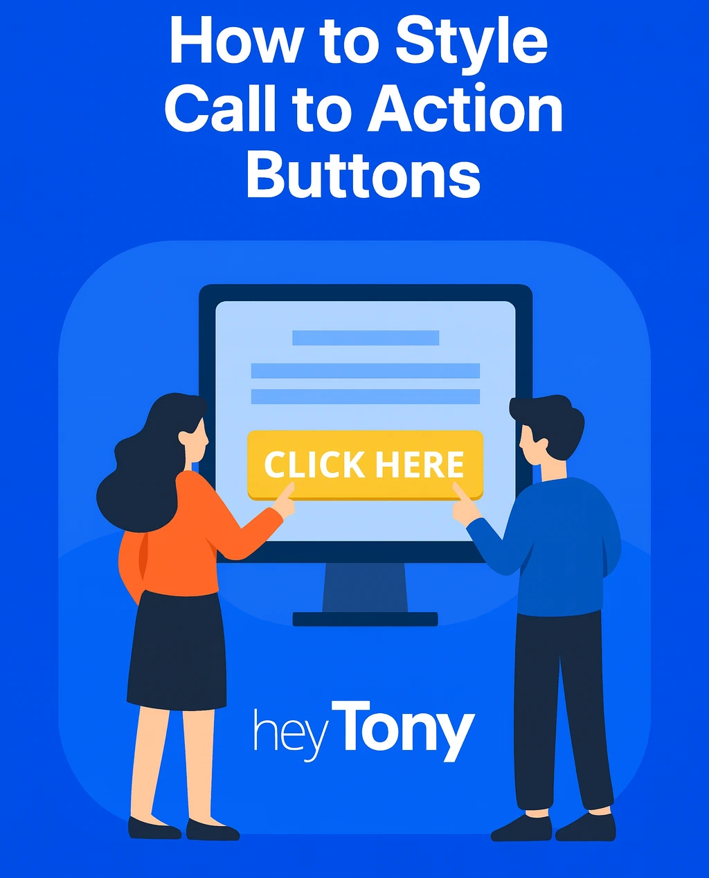
The fastest design lift comes from getting the basics of call to action button design right. Use these non-negotiables:
Size & Shape
Make the main button obviously primary. Use generous padding, rounded corners (consistent across the site), and at least 44px height for mobile taps. That’s how call to action buttons feel effortless to use.
Contrast & Readability
Prioritize legible text over brand flourish. Ensure strong contrast between button and background—and between text and the button. If you’re fine-tuning palettes, this article on button color psychology helps you balance brand with visibility.
States & Feedback
Show hover, focus, and disabled states; add a brief loading state after the click on longer actions. Accessibility isn’t optional—it’s part of call to action button meaning.
Replace vague verbs with outcomes: “Get the Guide,” “See Pricing,” “Book a 15-Minute Call.” Add a micro-line below when needed: “No card required,” “Two-minute form,” “Response today.”
Your step: Choose one high-value page and apply all four. If design changes require templates, our Web Design in Hamilton team bakes these rules into layouts that scale.
Placement, Mobile, and UX That Make CTAs Unmissable
Where you place the CTA determines whether it gets seen at the moment motivation peaks.
1. Match Reading Patterns
People scan in an F-shape on desktop and a top-down streak on mobile. Put primary actions close to intros, summary boxes, and section ends. See practical F pattern placement and map your buttons accordingly.
2. Design for Thumbs First
Most visitors are on phones. Keep tap targets large, away from edges, and avoid pop-ups that smother the button on load. For a tight checklist, use our guide to mobile CRO.
3. Remove Friction You Can’t See
Slow pages, long forms, and mismatched messages kill clicks. Align headline → button → landing-page promise. Then trim fields to only what’s needed for the next step. Start with these wins to improve your website’s user experience.
Your step: Add one above-intro CTA and one end-of-page CTA for the same action. Keep any other actions clearly secondary. That preserves cta meaning and prevents decision fatigue.
Ready to turn these tips into lifts on your site? Book a 15-minute consult and we’ll map your next two tests together.
Copywriting, Links, and SEO: Make the CTA Do Its Job

A great button can’t rescue confusing copy. Here’s how to write the surrounding words so the visitor and search engines understand the promise.
Answer the Real Question
If a reader wonders what does call to action mean in writing, your job is to show—not tell. Use a short sentence above the button that names the outcome: “Get a custom quote for your project.”
Use Descriptive Links
In editorial content, text links can convert better than big buttons. Label them clearly with descriptive anchor text: “See pricing,” “Download the SEO checklist,” “Compare plans.” That’s good UX and good SEO.
Optimize Without Stuffing
Work your primary keyword (cta meaning) into the title, introduction, and a few headings where it reads naturally. Sprinkle secondary phrases—call to action button, call to action meaning, call to action meaning in marketing, call to action button meaning—where they truly fit. If you want broader visibility, consistent technical SEO matters too; our Search Engine Optimization service ensures your CTAs are discoverable by the people who need them.
Respect the Reading Flow
Blog CTAs shouldn’t break the narrative. Use soft prompts after intros, then a single, relevant step per section. For layout patterns that convert without shouting, see blog formatting for conversions.
Keep the User at the Center
Outcome-first language and empathetic microcopy are part of end-user optimization. When visitors feel understood, clicks follow.
Your step: Audit one article. Replace generic “Learn More” with a benefit-driven link and align the landing page headline to the exact promise.
Social and Cross-Channel CTAs (Quick Wins)
CTAs aren’t just buttons. On social, small asks compound: “Save for later,” “Comment ‘guide’ for the link,” “Share with a teammate.” Build channel-native prompts using our walkthrough on how to create a call to action on Instagram, then mirror the same outcome on your site so the path feels seamless.
Your step: Pick one recurring social format and add a matched on-site action (same language, same promise).
Two-Week Implementation Plan (No Guesswork)
Week 1
- Choose one high-value page.
- Define one outcome and write the button copy.
- Add above-intro and end-of-page CTAs for the same action.
- Apply the styling basics (size, contrast, states).
- Align headline → button → landing-page promise.
- Reduce the form to essentials.
Week 2
- Test on a mid-range phone over mobile data.
- Measure section views, button clicks, and completions.
- A/B one variable: button text, placement, or helper line.
- Keep the winner; log the learning; plan test #2.
If you want help prioritizing and testing, our Website Conversion Optimization sprints deliver plain-English findings and next steps. If you’re planning a redesign, we’ll architect CTAs into your templates via Web Design in Hamilton so they’re right from day one.
Frequently Asked Questions (Fast Clarifiers)
What does CTA mean?
CTA meaning is a prompt that asks the visitor to take a specific next step with a clear outcome. In short, call to action button meaning = priority action, obvious result.
What does call to action mean in marketing?
It’s the combination of offer, copy, design, and placement that moves someone forward. Done well, cta means progress for the visitor and results for the business.
What does call to action mean in writing?
It’s a line that directs the reader to a benefit-driven action, e.g., “Get the checklist,” “See pricing.”
Originally published . Last updated .
Categories:

Explore More