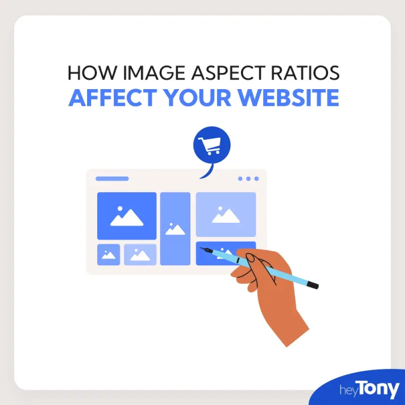
When building a website, you might not think much about the size and shape of your images, but this is more important than you might realize! The shape of your images, known as the aspect ratio, can impact how your site looks, how well it works, and even how high it ranks on search engines like Google.
So, what is an aspect ratio? It’s the relationship between the width and height of an image. For example, if an image is 1200 pixels wide and 800 pixels tall, its aspect ratio is 3:2 (1200 ÷ 800). Different aspect ratios are used for different purposes, and choosing the right one can make your site look more polished and professional.
In this article, we will go over what an image aspect ratio is and why you should care about it when uploading images to your website.
What Is Image Aspect Ratio
An image aspect ratio is the proportional relationship between the width and height of an image, expressed as a ratio (e.g., 16:9, 4:3, 1:1). It determines the shape of the image, whether it’s square, wide, or tall. Aspect ratios are important for maintaining the visual integrity of images across different devices and platforms, ensuring they don’t appear stretched or cropped in unintended ways.
Common Image Aspect Ratios
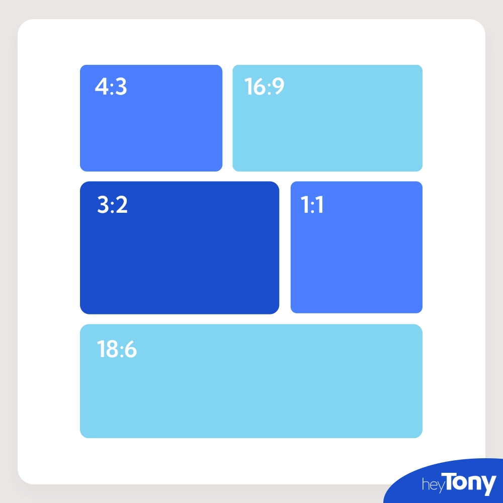
Here are some common aspect ratios you’ll encounter:
- 1:1 – This is a perfect square, often used for profile pictures or thumbnails.
- 4:3 – Common for older television screens and computer monitors, this ratio works well for many photos and product images.
- 16:9 – The widescreen format used for most videos and modern screens. This is great for hero banners and videos.
- 3:2 – Often used in photography, this is a balanced ratio for showcasing images without too much space on the sides.
- 2:1 – A wide, panoramic format, useful for banners or slideshows.
Each aspect ratio has its ideal use case, but making sure they’re used consistently across your site is key for a smooth user experience.
How Image Aspect Ratios Affect User Experience On Your Website
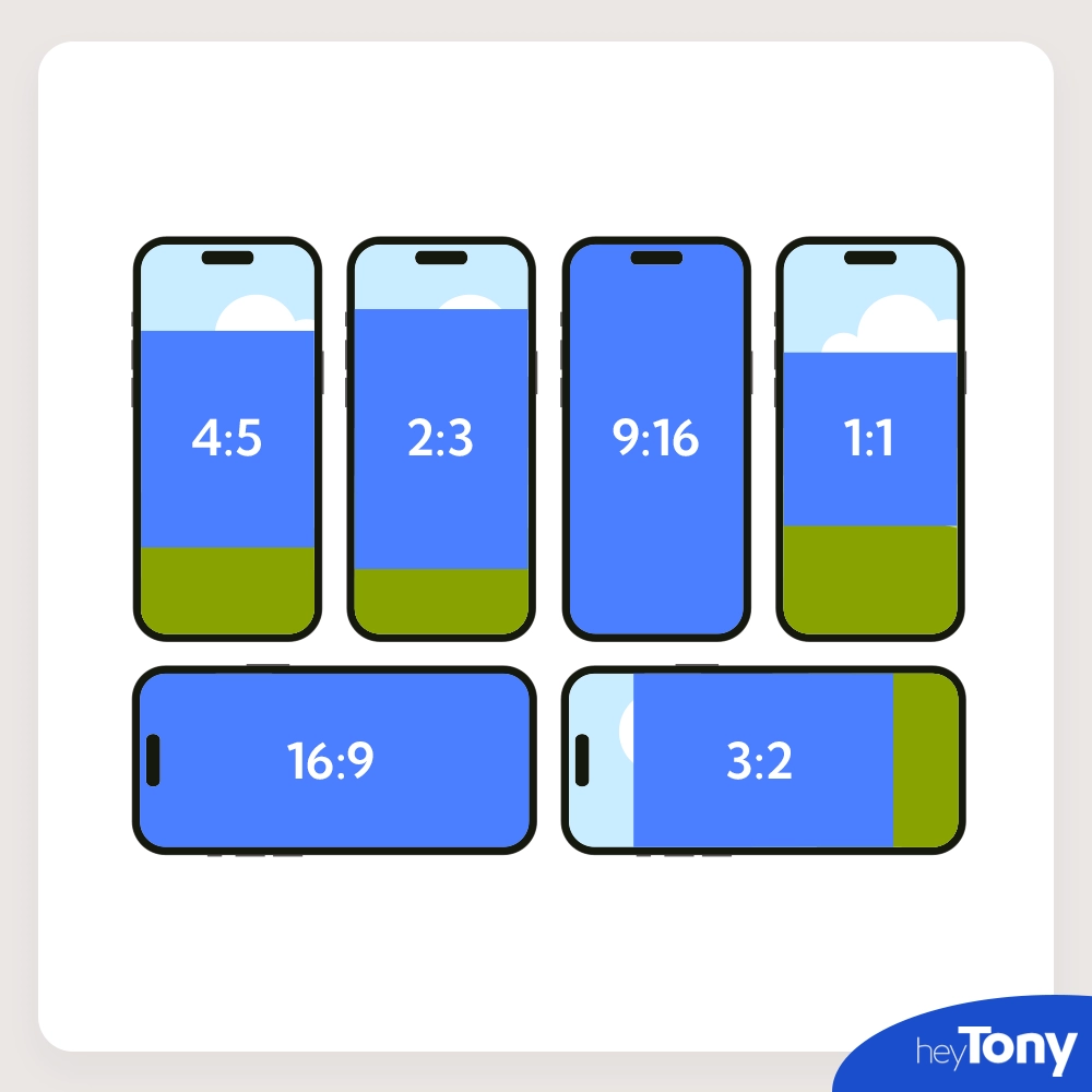
Image aspect ratios significantly impact user experience in several ways. First, visual appeal is key—imagine visiting a website where some images are tall and skinny, while others are wide and short. This inconsistency would look messy and unprofessional. Using consistent aspect ratios creates a more balanced, visually appealing site, making it easier for visitors to focus on the content. Mobile friendliness is also crucial, as many people visit websites on their phones. If images don’t scale properly on smaller screens due to incorrect aspect ratios, they may appear stretched or squished, making the site harder to navigate and less attractive. This can drive visitors away. Additionally, content focus is affected by aspect ratios. If the wrong ratio crops out important parts of an image, such as a product or a person’s face, it can confuse users. Choosing the right ratio keeps the focus on what matters in the image. Finally, loading times suffer with large images and incorrect aspect ratios, which slow down the site. Slow websites lead to higher bounce rates, further damaging user experience and site performance.
How Image Aspect Ratios Affect Website Performance
Image aspect ratios are really important for how fast and smoothly a website works. If you upload pictures that don’t have the right shape, the website has to do extra work to fix them. This slows things down, especially for people with slower internet or on phones. Websites that load fast are easier to use and show up higher on Google image searches.
When a website is designed well, pictures will look good on any device, whether it’s a phone, tablet, or computer. If the pictures don’t fit right, parts of the website might move around while loading, which can be confusing for visitors. This makes the website less fun to use and can hurt its ranking on search engines like Google.
Additionally, correct aspect ratios enhance the website’s responsiveness, allowing images to display properly across various screen sizes without distortion. Inconsistent aspect ratios can also cause layout shifts, where elements on the page move around as it loads. These shifts disrupt the user experience and can lower your website’s performance score, which search engines like Google consider when ranking sites.
How Image Aspect Ratios Affect SEO
Image aspect ratios can affect how well your site appears in Google search results. Google likes websites that load quickly. If your images have the right shape and size, they load faster, helping your site rank higher. Even their file format will matter when it comes to SEO. This is why we recommend uploading your images as webp. But if your images are too big or don’t fit well, your site can slow down, which hurts your ranking.
Mobile friendliness is also key. Many people use phones to visit websites, so Google prefers sites that look good on small screens. Using the correct aspect ratios ensures your images look right on phones, which can improve your ranking. Another thing Google looks at is Cumulative Layout Shift (CLS). This measures how much your page jumps around while it’s loading. If images aren’t the right size, your page can move around, which lowers your score with Google. Lastly, if your site has images that don’t fit well and make your site slow or hard to use, visitors might leave quickly. This increases your bounce rate, telling Google that your site isn’t user-friendly, which can hurt your ranking.
Image Aspect Ratio VS Image Resolution

Image aspect ratio refers to the proportional relationship between an image’s width and height. Image resolution, on the other hand, describes the amount of detail an image holds, typically measured in pixels (e.g., 1920×1080), which affects the image’s clarity and sharpness. While aspect ratio determines how an image is displayed, resolution impacts how clear and detailed it appears. Both factors are important for ensuring images look good on various devices and screens.
Resolution can also be described in terms of PPI (Pixels Per Inch), which indicates how many pixels are packed into each inch of the image. Higher PPI translates to more detail and better quality, which is especially important for printing. Higher resolution images typically have larger file sizes due to the increased amount of data, impacting loading times on websites and requiring more storage space.
Learn More About Image Aspect Ratios And Their Impact On Your Website
To ensure your website performs well and looks fantastic, follow these tips for using aspect ratios correctly. First, keep it consistent by choosing one or two aspect ratios for your images and using them throughout your site. Optimizing your images for speed by selecting the right aspect ratio and compressing them prevents slowing down your site. Finally, test on mobile to make sure your images look good on both desktop and mobile devices. Paying attention to these details can greatly enhance your website’s appearance, performance, and SEO ranking. It’s a small adjustment that makes a significant difference!
To learn more about image aspect ratios and other ways to improve the user experience on your website checkout our SEO blog!
Originally published . Last updated .
Categories:


Explore More